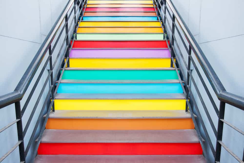
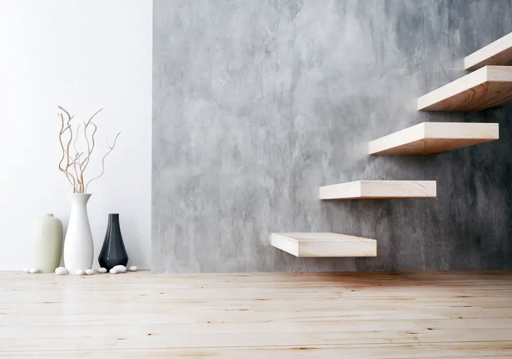
Can Stairs Be A Different Color Than The Floors?
Stairs are a transition space between the first floor and the second floor of your home. Since stairs are attached to these two different levels, the question is whether you can change their color to be distinct from these two while still complementing both floors.
Stairs can be a different color than your floors. If you plan on recoloring your stairs, you’ll need to figure out how to make them complement your stairs, how to go about mixing and matching the colors and finishes of the different parts of the stairs, and specific requirements that you’ll have to meet for coloring stairs.
Read on as we’ll be going into color palettes, hues of color, how stairs should be colored, how finishes can affect color, and many more. We’ll also have a creative exercise that you can use to better help you choose the color of your stairs!
The main goal of this article is to help on how to go about choosing the right colors for your stairs.
Color palettes and how to make your own!
Before you charge in and immediately start repainting/recoloring your stairs, we first want to get into color palettes and create your own one specific for your home!
For the purposes of this article, we’ll only briefly cover this topic since Color theory is such a wide topic that multiple articles can be written to explain it.
- Complementary
Complementary colors are those that are close to each other within a color wheel.
- Monochromatic
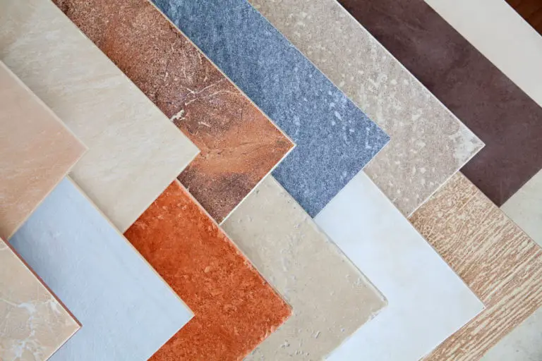
Monochromatic colors are those that are the same color but different hues. In designing interiors, wood is a common example of playing around with different hues. If you think about it, almost all wood finishes are color brown but the type of brown varies.
- Contrasting
Contrasting colors are those that are opposite to each other within a color wheel.
Making your own color palette is quite simple once you understand how colors work. For our purposes, you can make a simple color palette of 5 different colors based on your first floor and your second floor.
- The first color on your palette should be the color of your first floor.
- The second color should be a lighter/darker version of your first color.
- The third color should be a neutral version of the second color and the fourth color mixed.
- The fourth color should be a lighter/darker version of the fifth color.
- The fifth color should be the color of your second floor.
Using this color palette, you’re sure to get a staircase that can succeed at complementing both your first floor and your second floor’s colors. This is just one of the endless number of color palette combinations you can make for your stairs.
Understanding hues of color
We’ll also need to get into some essential characteristics of color to help you understand how you would want to go about recoloring your stairs. This will help you make better decisions on how you want to frame and set up your stairs in terms of colors.
- Tint (Light)
Tint can be described as the lighter version of a color. This is important to note as the higher the tint of the coloring on a material, it increases the tendency of the details of the material to be seen more.
- Tone (Neutral)
Tone is the combination of shade and tint, meaning that the color is often mixed with a shade of grey.
Using tone also has its own particular use. As the saying implies, it helps “tone down” the material and the object, which is great if you want to redirect a person’s focus to another object.
- Shade (Dark)
Shade is the darker version of a color. The higher the shade value of a color, the more black is added to it.
Shades tend to be heavy on the eyes, and it tends to catch people’s attention more than other colors. Shades also tend to hide the details of the material it’s on.
These three characteristics of color help designers created a more dynamic environment by purposely highlighting what’s good while downplaying what isn’t.
A simple example would be how cars are colored. If you think about it, most cars have colors that have a high level of tint, with wheel rims being toned(neutral), and the wheels themselves are often dark-colored(shade). Even if the car were colored black, the black of the car’s body would still be lighter than the black of the car’s wheels.
Stair Finishes
Stair finishes also play an important role in how your color will look, aside from just the color. For our purposes, we’ll describe the two characteristics of finishes that play a role in the stair’s visual impact on users.
These characteristics of finishes are:
- Glossy
Glossy finishes are those that reflect light. Colors on glossy finishes tend to look lighter since the reflection of light tends to capture the eyes more than just the color.
- Matte
Matte finishes are those that absorb light. Colors on matte finishes tend to look more solid since the absorption of light makes it so that the color stands out more.
Like hues of color, glossy and matte finishes are also used to direct where users will be paying attention to.
Using our example early, most of the time, the car’s body will be shinier than the rims of the car. In terms of aesthetics, it makes it so that people pay attention to the car’s design while practically it helps other drivers easily see the car at night(even if the car is black).
Considerations to take into account for coloring stairs
Stairs have different requirements than regular spaces. It’s one of the most accident-prone areas in any household, and as such, safety measures are always put in place to avoid this.
Aside from that, stairs are designed differently from other spaces because their function is to get you from one level of your house to another. These differences in design will change how your finishes will look compared to how they look on your wall or floor.
- Safety
In general, the treads and risers of the stairs should be somewhat visually distinct. This helps users easily identify where they need to step up/step down, which in turn reduces the chances of accidents happening.
- Light
Light tends to hit the stairs differently. Chances are your ceiling lights are quite far from your stairs, compared to their distance from your second floor. You’ll need to consider that stairs are often not as well lit during the nighttime as your other spaces.
Also, remember that the color of the light can also change how the color of the stairs will look (Ex. Natural light vs. artificial light), so you should try to choose a color that can work with both.
- How stairs are seen by users
As mentioned earlier, when climbing upstairs, users will see both the riser and the tread as if it were a wall. While going downstairs, they’ll only be able to see the treads as if it were a floor.
- Railings
The railings of the stairs should also be considered. Usually, most railings are the same color as the treads of the stairs to promote usage since both need to be distinct to be easily seen by users.
- Walls around the stairs
Your walls will probably be the main thing that your stairs will have to compliment. If you think about it, while using stairs, you will no longer look at the floors but look at the steps and the immediate area around it.
- The material of the stairs
The natural color of the material mixed with the color of the paint/finish used will change how the color will look when it sets in. Although most finishes are now capable of completely changing how a material looks (Ex. Concrete that looks like wood), only consider this if you intend to keep the original look of the material and only want to change its color.
These are the considerations that you should also take into account when choosing the color of your stairs. It may seem like a lot, and some of them don’t have a significant effect. It’s still a good practice to view things from all angles to help you form the bigger picture of what you should do.
Choosing the colors of your stairs (putting it all together)
In this section, we’ll suggest how you can choose the colors for your stairs. These guidelines apply everything we’ve mentioned above and put them together to make it easier for you to understand.
- Riser
Risers are only seen when going upstairs. You can either have them be a complementary or even slightly contrasting color from your stair treads. Its hue should be tone since you want the main focus of your stairs to be on your railings and risers(the part that people touch). Avoid using glossy finishes on risers because they can be overwhelming.
- Tread
Treads are the stairs that have to compliment both the first and second-floor colors since they act as the “floor” between the two levels. The best hue for a tread can be either tint or shade. The finish of a tread should almost always be glossy to make it easily identify them.
- Railings
Railings, by themselves, are already distinct from both the staircase and the floorings. A good color choice for railings tends to be a contrasting color from the wall beside the stairs. This makes it even more obvious that there’s a railing present, which increases the safety of using the stairs.
Creative exercise for choosing the color of your stairs
Now that we’ve gone into color palettes, hues, considerations, and finishes. We can now begin planning the colors of your stairs.
To make it easier to imagine how stairs are different from floors, you can imagine stairs as an angled “floor.” Since it’s angled, more of the floor is visible because it enters our scope of vision within a closer distance. Now, imagine that this floor has railings, doesn’t receive as much light, is tight and narrow compared to a regular floor, and is only used to get from one place to another.
To make it easier to pick a color for your stairs, here’s what you can do as a creative exercise. It’s recommended that you do this digitally since we’ll be working with colors.
- Draw 5 rectangles.
- From left to right, we’ll label these rectangles as 1,2, 3, 4, and 5.
- Rectangle 5 should be on top of rectangle 2 and 3.
- Rectangle 1 will be your ground floor. Color this rectangle with the same color that your ground floor currently has.
- Rectangle 4 will be your second floor. Color this rectangle with the same color also.
- Rectangle 5 will be the wall along the stairs. Color this rectangle with the same color also.
- Rectangle 2 and 3 will be your stairs. Rectangle 2 will represent your riser(attached to the ground floor), and Rectangle 3 will represent your treads(attached to the second floor).
- Risers look like a “wall” to users who are climbing up.
- Treads look like a floor to users that are going down.
- Mix and match until you find something that you like!
This is just a simple creative exercise, but it allows you to easily pick out colors easily and efficiently. You no longer have to guess how it would like because you can imagine how it would work.
Do I need an architect or interior designer when planning how to color my stairs?
Unless you plan on completely redesigning your stairs (changing the material, changing the finishes, changing the nosings, changing the design, etc.), then it’s not required to get an architect for this type of project.
However, it is advised that you consult an interior designer if you’re unsure of how to go about redesigning a space. Note that consulting an interior designer doesn’t mean that you’re hiring one. It just means you’re asking for their recommendation and paying a much small fee.
Conclusion
Choosing the colors of your stairs can be a bit tricky. There are an almost endless variety of colors as well as the finishes that come with them. Following design principles and knowing how things are viewed can better understand how you would want your stairs to look.
Colors have different characteristics that designers use to make spaces more aesthetically pleasing and to support their functions. Finishes also do the same. To make things easier, have a general idea of what color scheme you would want to use for your stairs, then work down to the specifics from there.