How to Tone Down Wallpaper in 10 Steps
Wallpaper is a great compliment and finishes for any space. However, sometimes wallpaper might be a bit too overwhelming. If you like the design of wallpaper or just want to avoid the hassle of changing it, then you’re going to have to get creative into how you approach toning it down.
There are many easy and actionable ways to tone down wallpaper without the need for renovations. The following list intends to serve as a guide for those who wish to make their wallpapers more in the background and/or bring out other components of the space.
A general rule of thumb for all things related to design is to establish how much visual input/processing you want a certain element to provide.
There are many ways to either strengthen, give emphasis, weaken, and tone down an element in any given space, as long as you apply the principles of design.
Here are the 10 steps on how to tone down your wallpaper:
1. Balance
All spaces are comprised of different elements. The composition of those elements is important in how the eyes will frame a certain space.
Balance the furniture, negative space (empty space), fixtures (curtains, trim, and etc.), and general room composition in such a way that remains neutral to the user’s attention. Balancing wallpaper within a space involves knowing how to make wallpaper as it should be, a background.
Avoid irregularities in how you use wallpaper and keep everything balanced and monotone, which will redirect the attention of users to objects of more interest.
2. Color
The color you choose for your wallpaper will determine how noticeable/eye-catching it will be. Stronger and “solidified” colors will cause more visual input for the user to process.
The solution for this is to use more desaturated colors. Saturation relates to the chromatic expression of the color. Saturated colors will be more intense and pure, while desaturated colors will be lighter due to its combination with white.
In simpler terms, desaturation is a lighter version of the color. It’s easier on the eyes for people because our minds see desaturated colors as less overwhelming. For comparison, think of a light perfume or a light broth.
3. Simplicity
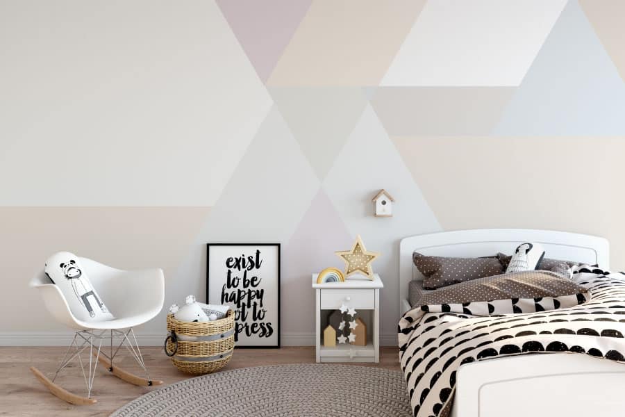
Simple wallpaper designs, which contain simpler details, can be used to reduce the amount of attention and visual input that it gives.
If you want to tone down the visual input that the wallpaper contributes to space, avoid wallpapers that use complex geometry, and instead go for simple repetitive lines.
4. Wallpaper type
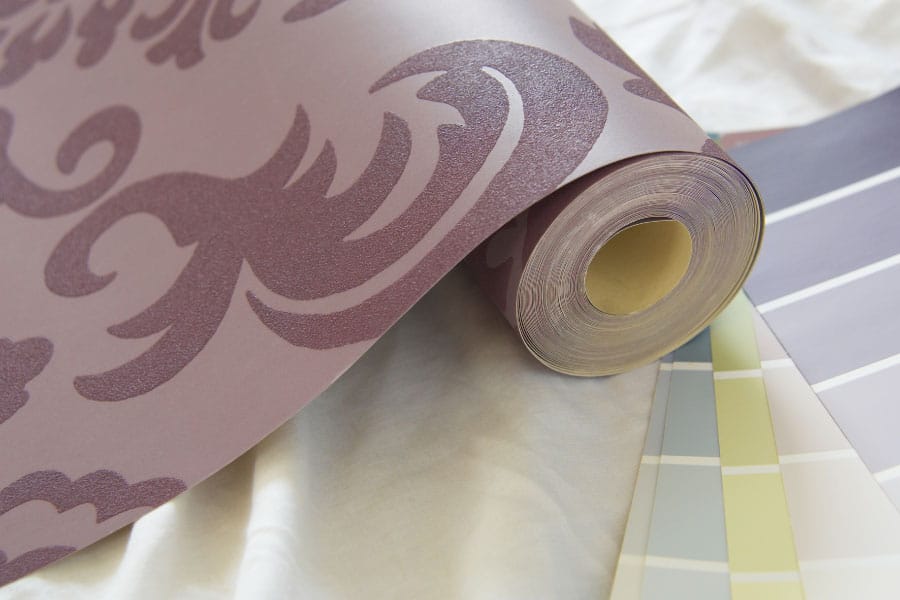
Using a matte finish for your wallpaper will make it inherently less eye-catching, which is what you want to do if you want to tone down your wallpaper’s place in space.
Glossy finishes reflect light, which our eyes are often attracted to hence the reason why jewelry is shiny.
A material finish, such as wood, can also be used as long as other objects in the room are more interesting, such as decorative trim or furniture.
5. Hierarchy
Our minds don’t take everything in at the same time. Instead, it prioritizes and creates an internal hierarchy based on multiple different factors based on either importance, relevance, and visual appeal.
To prove my point, look to your left. Chances are, when you looked, the first thing you noticed was the furniture, a light source, or an object. You most likely didn’t focus on your wall or trim at your first look.
A design concept that is related to hierarchy is using scarcity/rarity to stress importance or to take advantage of. Our brains always register what’s different rather than what’s common, and it’s such a wide phenomenon that companies bank on this.
In terms of design, use rarity to catch the attention of users such as an object that greatly differs aesthetically from the rest of the room.
6. Uniformity
Uniformity tends to make things boring. Once our brain has familiarized itself with a particular pattern, it tends to lose it’s attention to that particular element.
It can become so familiar that eventually, we stop even noticing it and only do so when we intentionally observe the object.
Use a wallpaper design that has a repetitive pattern in order to achieve this.
7. Contrast
The contrast between elements can be used to ensure that no one element will get too much attention within a given space. Contrast often means the opposite or in contradiction. In design, contrasting works well because it makes something much more visually interesting.
Imagine if everything were to be the same or similar, such as in repetition, it would make designs boring.
To apply this to space, try to contrast between details. If your wallpaper is uniform then further take away attention towards it by having contrasting furniture, layouts, colors and etc.
8. Focal point
Certain furniture, colors, and finishes can be used to redirect a person’s attention within a given space.
An example of a focal point would be fountains in the middle of the garden. Although it doesn’t take as much space compared to the greenery and is actually very small compared to everything else, the fountain becomes the center of attention, and the garden will be treated as its frame.
9. Lighting
Where the light touches, that’s where our eyes follow. It’s no secret that we can’t actually see in the dark, and as such, our eyes will always be fixated at what it can easily see.
Manipulating the lighting of your room will reduce the visibility of the wallpaper and, and as a result, will cause users to be more fixated towards wherever the light is centered.
10. Proportion
Wallpaper designs come in all shapes and sizes. The difference is that the design elements of wallpaper are usually 2-dimensional. It’s easy to get carried away with the sizes and scale of the design because it’s easier to make them bigger compared to 3-dimensional objects, considering that these designs don’t actually take up any space.
Choose a wallpaper design that does not include any elements that are bigger than objects within the space. Opt for smaller elements that won’t overpower the rest of the objects within the room.
Applying the steps
The steps that were laid out in the article are design principles that can be used for anything, whether it be a space, a finish, or an object.
These steps are not very strict, even applying only one of them will work well, and applying too much of it might not be a good idea. Remember that when working in design, everything affects everything.
The best way to apply these is to look at your current space and determine how to go about it. For example, if you have a window just hanging around, try to make it more interesting by adding nearby furniture or changing up the trim.
If you don’t want to renovate, you can try playing with focal points and redesign the layout of the space to be a central attention catcher; this could easily be something like a TV or a painting.
Conclusion
Wallpaper finishes will always be timeless pieces that can work with any space as long as it’s used tastefully and adequately. Spaces will change from time to time, and you’ll have to adjust elements in order to make it work.
The steps mentioned in this article will always work regardless of the situation, it’s just up to you on how you can creatively apply them and make it work.

